


CivicoZero is a Roman non-profit organisation born in 2008 from a Save The Children project. After more than 10 years of history, many projects completed and many activities supporting children, the cooperative felt the need to rethink the visual identity. The strategic map of actions was a key element for clarity and overview.
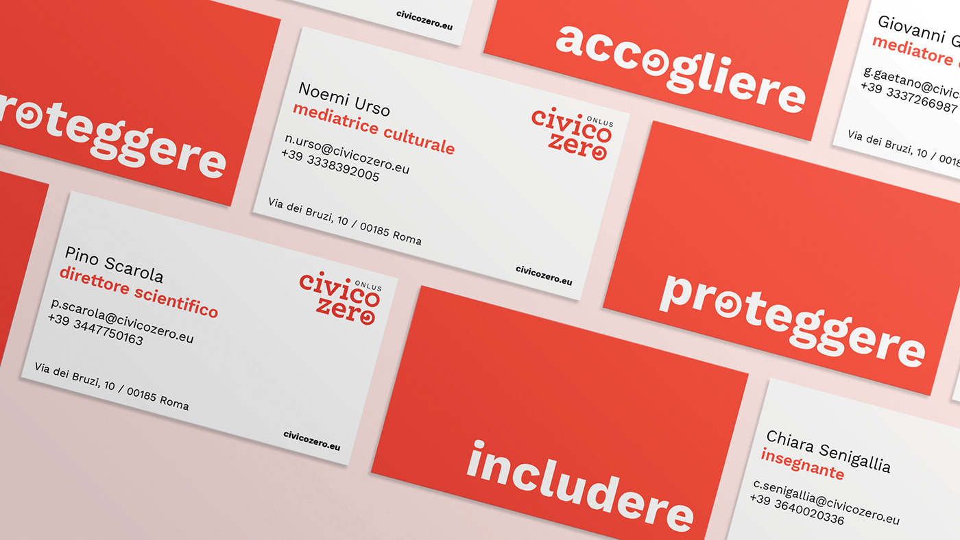
In the new logotype of the CivicoZero Onlus, equal importance was given to both words: "civic" as an expression of housing autonomy, of home, of a family ready to welcome you, and "zero" to underline the concept of low threshold and starting point for building a new life. The text aligned to the right encourages openness towards cultures different from our own. The symbol placed in the o of zero is the same c as the font used but deliberately reversed to express inclusion and mutual glances.
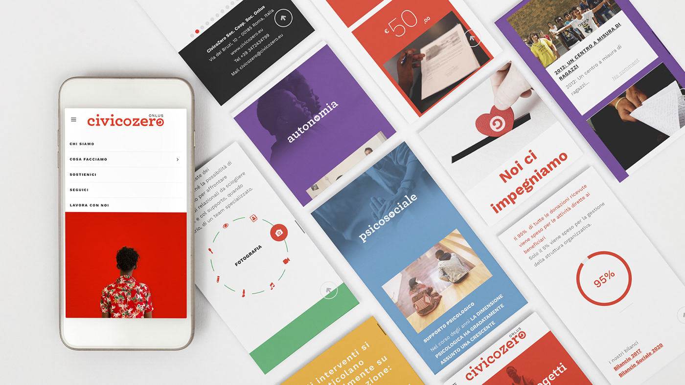
Red has been retained as the main colour of the visual identity as per tradition but with a new chromatic composition. The identity includes 4 other colours that identify the main areas of the centre: protection, education, psychosocial and autonomy.
In the new logotype of the CivicoZero Onlus, equal importance was given to both words: "civic" as an expression of housing autonomy, of home, of a family ready to welcome you, and "zero" to underline the concept of low threshold and starting point for building a new life. The text aligned to the right encourages openness towards cultures different from our own. The symbol placed in the o of zero is the same c as the font used but deliberately reversed to express inclusion and mutual glances.
Red has been retained as the main colour of the visual identity as per tradition but with a new chromatic composition. The identity includes 4 other colours that identify the main areas of the centre: protection, education, psychosocial and autonomy.


